About our new brand!
In April 2022, we announced a new look. Our logo, colors, and typography all got an overhaul. Pretty exciting, if you ask us! This article will give you some insights into Shapescape's big rebranding!
We worked together with Unikorns, a studio with fantastic and creative people that were able to achieve something beyond our expectations!
Our new logo!
Let's start with what's most apparent, our logo! Shapescape needed a meaningful logo, a logo that shows what we stand for. The new logo does precisely that.
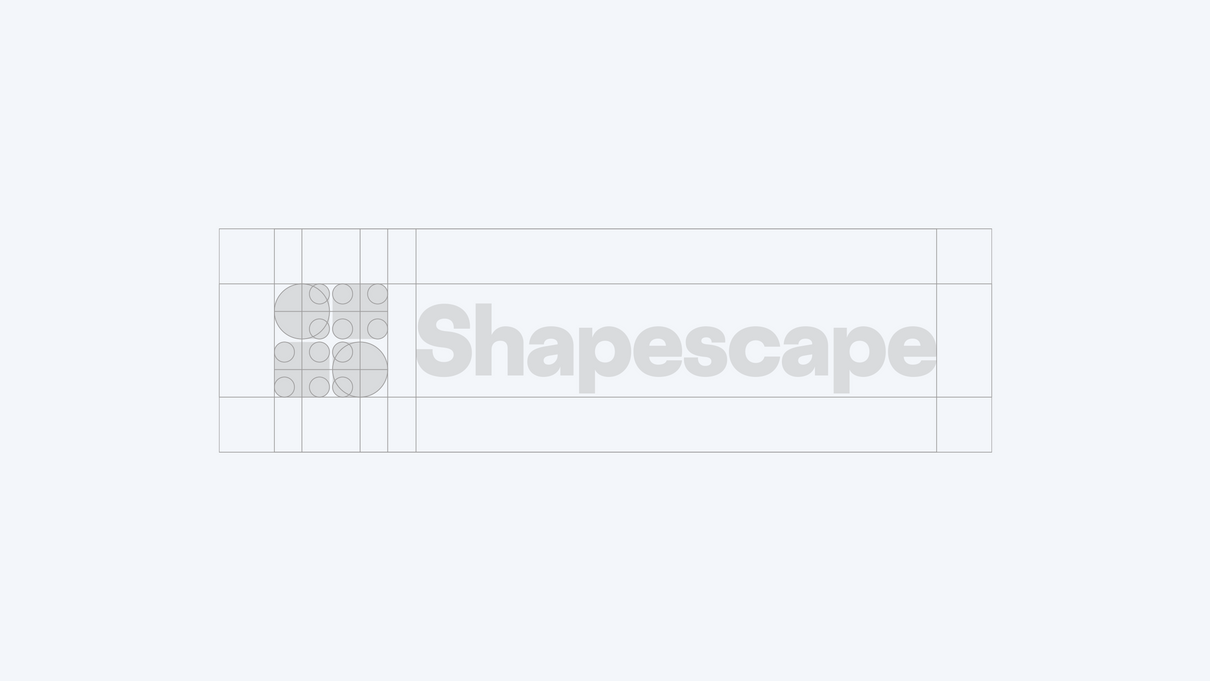
Of course, the logo is a scape made out of shapes, but keep reading! There's more to it! ;) The geometric shapes that form an S resemble wooden building blocks that many played with at some point in our lives. The same wooden building blocks resemble creativity, play, and imagination, three things that we value greatly.
Our new colors!
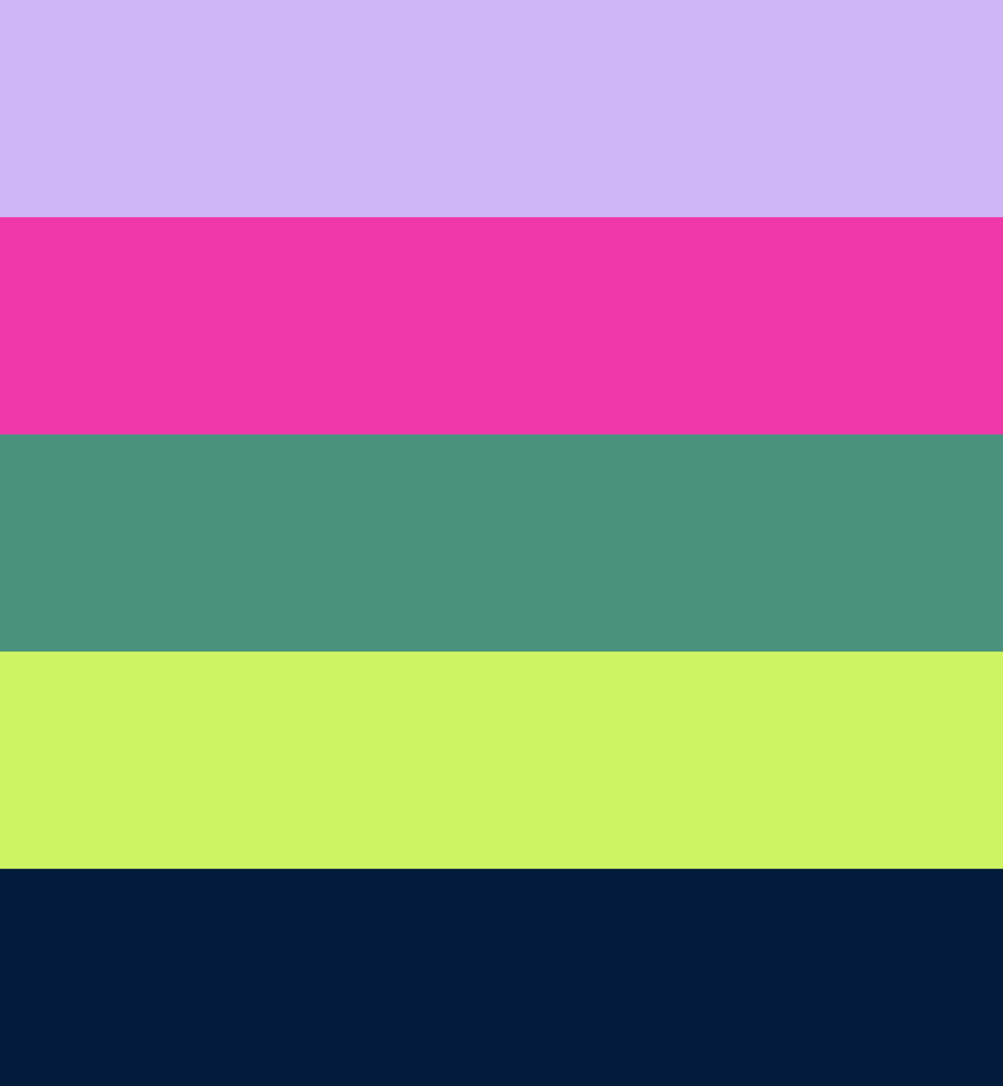
A new color palette! That's where the idea of rebranding initially started in November 2021.
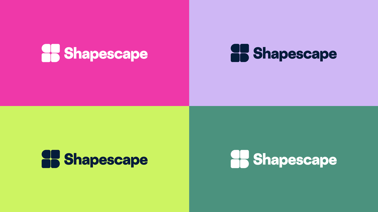
We wanted a palette with more unique colors and more possibilities in terms of design options. We ended up with a vibrant color palette, have a look yourself!
Quite a change from orange and teal isn't it?
Our new typography!
Less noticeable perhaps, but nonetheless an essential part of our rebranding.
After using the Proxima Nova font for almost all our corporate typography for around 2 years, we decided it was also time to change this aspect of our branding!
We chose to go with Agrandir Normal Heavy for a playful yet professional look for our Headers, and the Google Inter font for our body text. Combined they strike a great balance between professionalism and playfulness!
Agrandir is a contemporary serifless type family that celebrates the beauty of being imperfect. It was designed to be a brave antipode to neutral modernist fonts.
That's not all!
Besides the three branding aspects above, you'll also come across new icons and animations utilizing the shapes inspired by the wooden building blocks!
The rebranding was a pretty big step for us, as many of us were emotionally attached to our look that originated from our history as a Minecraft Build-Team. Still, we are thrilled to present to you our new look, one that focuses on what we stand for and where we want to take Shapescape in the future!
I hope this gave you some interesting insights into the changes we've recently made,
- Bram van Gent,
Chief Creative Officer @ Shapescape
Stay up to date with our newsletter!
By subscribing we will keep you updated on our latest releases, blogposts and other projects.
